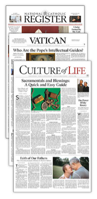
A New Look for the Register
Over the course of its history, the Register has seen six major design changes. Prior to the new design, making its debut in this issue, it had existed in the same form since 1995.
At the heart of the new design was an effort to make the newspaper read better (see “How to Read the Register” inside the Culture of Life section).
“We felt the image wasn’t in sync with the content,” said Joseph Hilliman, art and production director. He said the primary goal was to address the “visual hierarchy” of the publication — what stories and sections appear to be most important.
“And we wanted to enhance its overall image,” he said.
As part of the redesign, the Register enlisted the assistance of leading experts in publishing, such as Garcia Media, an international publishing consultant group that has been responsible for redesigns of the Wall Street Journal and numerous other papers. With the use of our new typeface Poynter Gothic Oldstyle text developed by the Poynter Institute, the Register is now easier-to-read.
In addition, typographer Gerard Huerta, known for
creating the nameplates for Time, Atlantic Monthly, and People magazine, as well as album covers
for the band
The logo, between the words National and Catholic, features the papal tiara and keys of the Kingdom, symbolizing the paper’s fidelity to the magisterium, and rays representing the light, hope and truth of Christ.
According to Hilliman, one of the limitations of the old design was the inability to move around elements on the front page.
While page one will retain all of its elements, each one has been created in various styles so their positions can be changed from week to week, providing variety.
The Inperson, for example, the Register’s question-and-answer personal interview, “was always located on the bottom of the page.”
Said Hilliman, “Now it can run elsewhere. So, if we’re interviewing someone with a more urgent story to tell, we can run it in a more prominent position on the page.”
Father Kearns compared the dual principles that guided the redesign to the focal points of an oval.
“An oval has two focal points that each rein in the other,” he said. “The two focal points of the redesign were the qualities of classic and classy.”
“Being classic in a classy way allows the newspaper to have stateliness and prestige for a paper of record, but not in a boring, staid or old-fashioned way,” explained Father Kearns. “Being classy in a classic way means not being loud, gaudy, tacky or cheap. That combination of classic and classy, each influencing the other, gives the Register its look.”
- Keywords:
- January 7-13, 2007


